Unspoken Volumes from August 29th to October 8th, 2022, at The Stamp Gallery | University of Maryland, College Park | Written by Ellen Zhang
Protruding from the white walls of the Stamp Gallery is Lion Heart – a small yet powerful sculpture. Despite the fact that it is the size of my hand, artist Hae Won Sohn has fit in a plethora of sharp edges, rounded surfaces, and all sorts of visual textures. With a somewhat rounded top and pointed bottom, the contours bear an uncanny resemblance to an actual heart. Aside from its physical similarities, Sohn’s sculpture also resembles the metaphorical meaning of a lion heart. From a denotative perspective, a lion heart is someone who is courageous and risk-taking. In Lion Heart, I see an artist who exhibits these qualities.
Shifting your position to the right of Lion Heart, you’ll notice two interesting choices Sohn has made in her creative process. First, a rigid edge that cuts through the piece like a shard of glass penetrating the heart. It protrudes out at an angle, obstructing the viewer’s ability to see the entirety of the piece from one position. Through this bold choice, Sohn exemplifies the concept of boundaries – something that forces us to look at things from different angles (almost literally) to find our answers. As a viewer, I find myself viewing her art from all sorts of directions and viewpoints to answer my own questions about the connection between the sculpture and its name.
Then, shifting your position to the left of Lion Heart, you’ll see a different concept embodied by the sculpture’s forms. From this perspective, the lines are soft and well-blended into flat surfaces. Everything seems blurred, but this is on purpose. Once again, Sohn has cleverly incorporated a way to express the metaphorical themes of her exhibition through the sculpture. The practice of blurriness, as described by the artist herself, is based on the notion that “some ideas and forms seem to become clearer in the blur.” According to Sohn, “This perhaps comes from my understanding of blurriness as more embracing of intrusions and embodying higher potential than what appears to be more defined.” The contrast between the smooth, flat surface and sharp ridges on the right side indicates that Sohn is “embracing intrusions” during her creative process. As a result, her work leaves viewers with an understanding of the nuanced meanings behind her work. When observing Lion Heart from the right, you can see qualities of bravery and confidence through the jagged and well-defined edges. From the left, you can see qualities of calmness and simplicity through the blunted surfaces. The duality in the interpretations of her work emerges because of Sohn’s own ability to embrace intrusions while creating her work.
Sohn is certainly an artist with a “lion heart.” She welcomes disruptions in her own thinking process, thus enabling her to incorporate bold contrasts in the forms and shapes of her work. Through Unspoken Volumes, Sohn is even able to challenge her viewers to include boundaries and blurriness in their own thinking. She encourages us to surpass boundaries and look at questions from all angles. She also encourages us to embrace intrusions in our own thought processes, sparking internal conversations provoked by gray areas – terms, subjects, and objects that do not conform to a singular category.
Lion Heart is included in Unspoken Volumes at The Stamp Gallery of the University of Maryland, College Park, from August 29th to October 8th, 2022. For more information on Hae Won Sohn, visit https://haewonsohn.com/. For more information on Unspoken Volumes and related events, visit https://stamp.umd.edu/centers/stamp_gallery.
Unspoken Volumes from August 29th to October 8th, 2022, at The Stamp Gallery | University of Maryland, College Park | Written by James Cho
Resting on the floor of the Gallery sits Wallflower (orchid), a mixed-media sculpture by Hae Won Sohn, among the other wondrous pieces of the Unspoken Volumes exhibition. One of three artworks titled “Wallflower” in the gallery, (orchid) was born from Sohn’s desire to create artwork that stands by itself without a pedestal or wall, while the other two sculptures, Wallflower (thatch village) and Wallflower (King Moth) occupy wall space. Moreover, though it may not seem like it, Wallflower (orchid) is made of cardboard collected from boxes of shipments to Sohn’s studio that she folded repeatedly, as well as tape, pushpins, acrylic, and plaster painted over with a coat of light purple. Like a real orchid, visitors can distinguish the smaller petals flanking the mouth of the orchid and the third, larger petal behind the mouth of the flower. But if you kneel down and take a closer look at Wallflower (orchid), you can see how this blur of materials comes together to create not just the general form of an orchid, but also the organic folds and even the veins of the flower. This speaks volumes about the unity Sohn is able to achieve in juxtaposing both geometric and organic forms through materials of unique origins.
Hae Won Sohn, Wallflower (orchid), 2022. Cardboard, tape, pushpins, acrylic, plaster.
It also speaks to the very essence of what orchids represent in places like Singapore, where I grew up. Notably, the national flower of Singapore is the Vanda Miss Joaquim orchid, hybridized by the orchid’s namesake Agnes Joaquim in 1893, itself underwent a rebirth recently. The recategorization under the Papilionanthe genus acts as an apt development in the context of the “blurriness” concept that Sohn expresses in all her artwork in the Gallery. For reasons besides this name change, the Miss Joaquim orchid was chosen as the national flower because:
“As the flower most associated with hybrids, the orchid is also a symbol of our multicultural heritage. It is representative of the harmony among our ethnic communities, as well as with our many foreign visitors.”
A bouquet of Papilionanthe Miss Joaquim orchids, originally bred in 1983 by Agnes Joaquim.
Mr. Mah Bow Tan, Minister for National Development, at the Singapore Orchid Show, 2006
Through this symbolism, Wallflower (orchid) serves as a manifestation of Mr. Tan’s belief in the harmony of the Singaporean people, in the very same manner in which the mix of cardboard, plaster, and other materials come together in Wallflower (orchid) today. Like Singapore, the artwork as a whole blurs the lines between its materials to become a single being. Just like how the hybridized shape and color of the Miss Joaquim orchid carry this message of cultural unity, Wallflower (orchid) carries the stories of its individual parts that have blurred together into this new design.
The choice of giving the title of “wallflower” to this piece is quite puzzling, though, when compared to the other two works in the gallery that bear the same title. The formal definitions for a wallflower is that of a European flower that is either yellow, orange, or brown in nature, or when describing a person characterized as being shy or awkward. But unlike Wallflower (King Moth) and Wallflower (thatch village), which are both situated on walls facing away from the gallery’s windows and in indirect light as their name implies, Wallflower (orchid) does not live up to the definition of a wallflower. Instead, it basks in the direct light of two overhanging spotlights on the open floor of the Gallery. Because of this stylistic choice in (orchid)’s presentation that contradicts the concept of a wallflower, visitors may wonder as to why Sohn chose to do so, especially since the other two Wallflower artworks are of similar proportions to Wallflower (orchid).
Regardless, both Wallflower (orchid) and the Miss Joaquim orchids illustrate how a simple yet beautiful design composed of materials with differing origins together represent the many “unspoken volumes” of their past and future. Whether that be the materials of the Wallflower (orchid), or Miss Agnes Joaquim’s hybridization of orchids into the Papilionanthe Miss Joaquim, both capture the essence of harmony and unity in their current form.
Hae Won Sohn’s work is included in Unspoken Volumes at The Stamp Gallery of the University of Maryland, College Park, from August 29th to October 8th, 2022. For more information on Hae Won Sohn, visit https://haewonsohn.com/. For more information on Unspoken Volumes and related events, visit https://stamp.umd.edu/centers/stamp_gallery.
Unspoken Volumes from August 29 to October 8, 2022 at The Stamp Gallery | University of Maryland, College Park | Written by Isabella Chilcoat
Hae Won Sohn, a New York-based artist and craftswoman, has graced the Stamp Gallery with a new art presence that straddles the unspoken and the overlooked crevices between shape, color, and space. Dovetailing three-dimensional objects and multimedia work, Sohn’s minimalist creations consume the gallery’s white walls in a breathy pastel mirage that I desperately want to consume. I cannot describe her palette better than melted ice cream colors complete with an offering that ranges from neapolitan to mint chip. After visiting this exhibition viewers will leave wanting at least two scoops.
Hae Won Sohn, chocolate milk cow milk, 2022. Plaster and oxide pigment. Currently on loan at the Stamp Gallery, College Park, MD.
But the real scoop is better than everyone’s favorite creamy delight. Take chocolate milk cow milk, 2022: Made of plaster and milk chocolatey brown oxide pigments, this triptych (collection of three) and a half cast sculpture set blooms from the gallery’s main wall. Parallel to the exterior windows, chocolate milk cow milk is visible to any person perusing the hallway, but it is worth moving closer. From a more intimate distance, one can examine the swirled pigments within each object’s silky crescent surface. Chocolate milk cow milk exemplifies Sohn’s conception of “burry objects,” a phenomenon she describes as both a “physical and metaphorical quality of [her] work in [her] vision which occurs as a result of exploring and adjusting distances through(out) time.” None of her works are detached from their origin, process, or the space they occupy. Accordingly, each of the works in Unspoken Volumes encompasses the cooperation of every contributing source which ensured the presence of the objects in the room. This includes the personal and the material antecedents that work together to make her art making possible – initial inspiration, the sources of material, molds, media, availability of exhibition space, reception of the work, and individual response to name a few. Through an appreciation of each work’s origins coupled with the present viewing moment, Sohn’s art grows in complexity while appearing as a simple form. In essence, the space feels complete. Her art is so inclusive to process and presence that walking into the gallery translates a deep calm or inner satisfaction.
” Some ideas and forms seem to become clearer in the blur. This perhaps happens from my understanding of blurriness to being more embracing of intrusions and embodying higher potential and energy compared to what appears to be more defined. “
Sohn, unspoken volumes artist statement, 2022.
An all-encompassing blurriness arises through observation of Unspoken Volumes from a macro and micro perspective. The space as a whole breathes as if every object pumps in a synchronized heartbeat while the individual pieces still emit a cadence of their own. I can relate to the idea of blurriness in my own attempts to grasp the origins of each piece of art and my present interpretation at the same time. These lines of comprehension become fuzzy the harder I ponder over one of Sohn’s smooth sculpture surfaces and the shadows cast between objects in a set. I am overwhelmed by the compositions Sohn has crafted through fundamental art elements juxtaposed with their conceptual depths that exceed the places from where I stand to observe them. Even the best images fail to capture the multitudes Sohn’s works contain; something as simple as an alteration to lighting or angle of viewing reveals a whole new landscape for each piece. I argue the modesty of abstracted forms alone attests to the beauty of contemporary art as a whole, and Unspoken Volumes is no exception.
various angles of Sohn’s chocolate milk cow milk, 2022, in the Stamp Gallery
Come visit the Stamp Gallery to explore this existential landscape cast by Unspoken Volumes for yourself, and tune in to hear from the artist herself on Thursday, Sep 8, 2022 during her artist talk in the space from 6:30-8:00 pm.
Hae Won Sohn’s work is included in Unspoken Volumes at The Stamp Gallery of the University of Maryland, College Park, from August 29 to October 8, 2022.
Sohn will deliver an artist talk on Unspoken Volumes in the Gallery on September 8, 2022, 6:30-8:00pm. For more information on Hae Won Sohn, visit https://haewonsohn.com .
Distinct Chatter from April 8 to May 20, 2022 at The Stamp Gallery | University of Maryland, College Park | Written by Hannah Zozobrado
Along one of the walls of the gallery hangs a black-and-white striped shirt, cut into curved strips that defy the thin, horizontal stripes. The slits on the left and right side of the tee curve symmetrically in opposite directions. The work is Charlotte Richardson-Deppe’s Just a Shirt (2021), which also has multiple colored pins poking into each strip of material, sticking out of the shirt and giving the piece overall dimension. For Richardson-Deppe, the chopped piece of clothing is a reminder of a bitter story.
The story that accompanies Just a Shirt is as follows:
It is the spring of Richardson-Deppe’s senior year of college, and she and her friends are spending a night in a Chicago hotel. They encounter a middle-aged man in the elevator, and he strikes casual conversation with them. They all arrive at their hotel room soon after; the hotel room’s phone begins to ring and Richardson-Deppe’s friend answers the phone – the caller is the man from the elevator, asking if the girl in the black and white shirt is in the room. Richardson-Deppe is the girl in the black and white striped shirt.
The friend lies and hangs up the phone. They are all scared, and they call their male friend – “tall and strong” – to request their room change at the front desk. They finally change their room, but the fear and paranoia does not depart as they ensure that the doors are locked.
While the title is Just a Shirt, the material is more than that to Richardson-Deppe. It is, in fact, just a shirt in its appearance, but this shirt is a reminder of a chilling dilemma that she had to experience as a woman and had to resolve with the help of a man. It is a reminder of the feeling of hopelessness that comes with knowing you are being surveilled by an unknown man with unknown intentions – something that many women experience in a patriarchal society.
Charlotte Richardson-Deppe, Just a Shirt, 2021. Shirt, pins, 16” x 18”.
The cuts that curve outward from the shirt’s middle center look as though they take the form of the female reproductive system. This piece is representative of what it means to be a woman in a society where men can be either predatory or heroic – and either way, the woman is to succumb and yield to man, whether that be as their prey or damsel in distress.
The shirt is formed by these symmetric slits in the material, and the rightward and leftward curve of these cuts on the shirt cause a split in the overall work. With this, the tee represents womanhood while also drawing a literal and metaphorical line between the experiences of women and men.
The pins on this work, which are typically used to help in mending rips and tears at cloth, only jab into the material with an ostensible purpose of pinning the strips to the wall. The pins also make the shirt feel unmoving; this is to say that the sentiment of reinforcing society’s rigid social and patriarchal structures are to remain unchanged, or at least difficult to change.
Just a Shirt shows that objects, contrary to their simple appearances, can often take up the space beyond their physical composition. They encompass the memories that evoke strong emotions, like disgust and fear, while also becoming a symbol and motif of lived experiences; this piece, in the context of what had happened as the shirt was worn, is critical commentary on what it is like to be a woman: having to keep an eye out for our well-being and, like Richardson-Deppe, even sleep with one eye open.
Just a Shirt tells a story that many women are able to relate to – no matter the shirt they choose to wear.
Charlotte Richardson-Deppe’s work is included in Distinct Chatter at The Stamp Gallery of the University of Maryland, College Park, from April 18 – May 20, 2022.
For more information on Charlotte Richardson-Deppe, visit the University of Maryland’s Department of Art.
For more information on Distinct Chatter and related events, visit the Stamp Website.
Distinct Chatter from April 18 to May 20, 2022 at The Stamp Gallery | University of Maryland, College Park | Written by Isabella Chilcoat
You’d be surprised by how many people have asked me who Hosna Shahramipoor’s model is for her photographs in the gallery and are shocked to learn that they are self portraits.
To me, their confusion speaks volumes about how necessary her portraits are.
Hosna Shahramipoor, Video Arts, 2022, digital media 0:30s.
A second year MFA candidate in the University of Maryland Department of Studio Art, Shahramipoor already holds BA and MFA degrees both from University of Art, Tehran, and she has been photographing professionally since the early 2000s. Now her recent collection of self portraits occupies the walls in our Stamp Gallery as she wraps up this year’s MFA portfolio. Following a trend of distortion, marring, and fracturing, each portrait exhibits some degree of manipulation to the face or the throat applied directly to the surface of the image with various materials. Shahramipoor employs herself as the subject of each photograph, challenging viewers to look beyond implicit biases that often accompany first impressions – @ my confused gallery attendees – about race and identity based on her appearance. She, as an Iranian woman, is inevitably a member of an often harmfully miscategorized community of people who do not always appear the way others expect, especially in the U.S. Her physical appearance contradicts the Western stereotype that prescribes dark hair, eyes, warm, tanned skin, and a hijab as the standard for Middle Eastern women.
She, distinctly, is not white, as portrait I Am Not White (2022) aptly asserts through a glossy archival paper printed photograph with pins filling the box letter shapes of this phrase over her distant countenance. Furthermore, the gaze of the subject peers straight through the viewer with a mix of severity, solemnity, and exasperation that harmonizes with the portrait’s color palate of rosy browns and taupes. Hung at just the right height, Shahramipoor’s gaze pierces at eye level to reiterate “I AM NOT WHITE,” undoubtedly a worn-out phrase, spoken so often that each utterance, every situation urging that clarification, conversely pierces into the skin like a sharp needle. This piece is not the only portrait intoning a theme of false assumptions, but it is perhaps the most obvious rendering of the concept.
Hosna Shahramipoor, I Am Not White, 2022, glossy archival print on paper.
Video Arts (2022), by Shahramipoor, on view in the second half of the gallery, may easily read as a feeling of fractured identity or wounding. The thirty-second clip features a still portrait of the artist that is progressively obscured by jagged, triangular incisions that resemble pieces of a broken mirror. Starting in a haloing progression around her face, the incisions continue and grow longer as they slice into her seated body covering her entire being until they disappear and the video loops to the beginning. The artist’s act of visceral mutilation through delicate, meticulous execution creates portraits that are nothing short of poetic.
Shahramipoor’s focus on self portraiture and the cool intensity of her stare speak to the viewer beyond archival paper and a projected screen as if saying “face me.” I urge anyone to visit the gallery to witness these portraits in person and to confront their own internalized biases.
Hosna Shahramipoor’s work is included in Distinct Chatter at The Stamp Gallery of the University of Maryland, College Park, from April 18 – May 20, 2022.
For more information on Hosna Shahramipoor, visit the University of Maryland’s Department of Art.
For more information on Distinct Chatter and related events, visit the Stamp Website.
Distinct Chatterfrom April 18 to May 20, 2022 at The Stamp Gallery | University of Maryland, College Park | Written by Marjorie Justine Antonio
In the last few weeks of the Spring 2022 semester, Stamp Gallery visitors can interact with Richardson-Deppe’s soft sculptures, Two Pants (2022) and Six Pants (2022), by tucking themselves into the supple and seemingly infinite loop of fabric. Tangled together, the visitor and the sculpture become one, blurring the line of where the person begins and the pants sculpture ends. Here, Richardson-Deppe allows the casual gallery visitor to be intimately acquainted with her work, both literally and metaphorically.
Charlotte Richardson-Deppe, Two Pants Portraits, 2022. Print on archival paper, 18” x 14”.
Richardson-Deppe’s work dynamically entangles fabric, fiber, and other textiles with themes of queerness, pain, love, loss, rest, desire, entanglement, memorial, and persona. Richardson-Deppe’s describes her work as “embodied autotheory” and writes that she is “preoccupied with the way that memories, relationships, and emotions are embedded in the cloth and clothing that humans surround ourselves with.”
Richardson-Deppe self-identifies as a queer feminist textile artist. A few of her exhibiting works speak directly to her identity and relationships, from her embroidered fabric work, Pillowcase (2021), and video performance Bodyknots (2022) with Mary Kate Ford.
Charlotte Richardson-Deppe, Pillowcase, 2021. Cloth, thread, 32” x 16”.
Pillowcase (2021) is the first mounted work visitors see when they enter the gallery. The mauve pillow case is punctured by red thread, and its accompanying placard transcribes the embroidered text, reading:
This pillowcase is for my lover’s pillow she will rest her cheek on these words she will sleep here and dream here I made this out of my love for her. This pillowcase will be cherished like my grandmother’s quilt which also lies on this bed, like the shirt I now wear that my aunt sewed for her brother, my father. Only the handmade receives this level of care, of protection, of desire. It is tailored solely for its intended purpose: it is singular and specific and made for Gabby for their extra long pillow that I stole from them each night when we first started dating, for this pillow that now lives on our bed that we share, on Gabby’s side of the bed, where we rest our heads, sleep, dream, whisper, cry, collapse, and sing.
Charlotte Richardson-Deppe
Here, Richardson-Deppe’s work immortalizes the connection between material objects and her significant others. Richardson-Deppe describes how her affection for her lover, Gabby, will be inscribed into the pillowcase, which will be cherished as the other clothing and material objects given to her by her family. The narration takes the reader through an intimate history: from the artists’ queer relationship and the future they dream up together. Through the patient process of embroidering letter by letter, memory and human relationships are tied to this intimate act of care.
Another example of queer intimacies is Bodyknots (2022), a performance video by Charlotte Richardson-Deppe and dancer Mary Kate Ford.
The video depicts two femme-presenting people entangled in thick, red soft rope interacting in a field of grass shrouded by thick clouds. This piece highlights the dynamic between two individuals who seemingly are unable to escape each other as they are bounded by a tangible thread. One pulls on the rope and the other attempts to escape until they both tumble to the ground together. In the grass, they both rest after a contentious struggle against each other, and share an affectionate cuddle, before helping each other rise again.
Stills from: Charlotte Richardson-Deppe and Mary Kate Ford, Bodyknots, 2022. Video, 7 minutes.Stills from: Charlotte Richardson-Deppe and Mary Kate Ford, Bodyknots, 2022. Video, 7 minutes.
Bodyknots shows the struggles of a relationship, whether that be the reckoning of one’s body and self, or between a loved one or partner. The red rope that connects the two performers together is symbolic of a key theme in the artist’s work:
“At its core, my work is about interdependence: I explore the joints and disjoints intrinsic to relying, depending, and caring for oneself and others in the world.”
Charlotte Richardson-Deppe
Charlotte Richardson-Deppe shines in the University of Maryland, 2nd year MFA in Studio Art group exhibition, Distinct Chatter, through her tactile soft sculptures, narrative descriptions of visible mending and darning, and queer intimacy through both thread and video. Her work entices the casual visitor to take a seat, get comfy, and ponder what it means to be comfortable in one’s own body and clothing.
See more from Charlotte Richardson-Deppe in “Distinct Chatter” — The STAMP Gallery’s current exhibition featuring three 2nd year MFA students, Mercedes, Hosna Shahramipoor, and Charlotte Richardson-Deppe, and is open until May 20, 2022.
Additionally, Charlotte Richardson-Deppe will be hosting a Visible Mending Workshop on Wednesday, May 11, 6:30-8:30 pm, co-hosted by Studio A and Stamp Gallery.
Distinct Chatter from April 8 to May 20, 2022 at The Stamp Gallery | University of Maryland, College Park | Written by Fiona Yang
En Sonido is easily the most striking piece in Distinct Chatter. Created by Argentinian-American artist Mercedes, En Sonido — translating to Sound Loop — is a metal basin that sits in the back of the gallery. Printed on the floor of the basin is a picture and accompanying biography of Jaime Jose Colmenares Berrios, an artist and photographer who disappeared into the Rio de la Plata during Argentina’s infamous “death flights” in the 1970s. A thin sheen of water fills the basin. Viewers are encouraged to move a pair of hydrocontact microphones around the floor of the basin to “find the heartbeat of the image.” When the “heartbeat” is found, the basin vibrates, creating unexpectedly beautiful patterns in the water and sending tremors through the hands of the viewer.
En Sonido by Mercedes
With En Sonido, Mercedes invokes a brutal history: a period of state terror and political repression across South America called Operation Condor, during which hundreds of thousands of people were kidnapped, tortured, and killed. She is one in a long line of artists trying to contextualize and memorialize “the disappeared.” This tradition is brilliantly examined in the catalogue for the North Dakota Museum of Art’s exhibition Los Desaparecidos (The Disappeared), which appears in the gallery’s pop-up library next to En Sonido. In the book, curator Laurel Reuter draws comparisons within a collection of works from artists in Argentina, Brazil, Chile, and Uruguay, all centered around the disappeared. En Sonido must be analyzed within this context. Among the work of her peers, the thematic similarities in Mercedes’ piece are thrown into sharp relief.
In the introduction to the catalogue, Lawrence Weschler notes in particular the use of faces, especially those of the victims. He quotes the essay “The Face” by Jean-Paul Sartre: “A bit of the future has now entered the room: a mist of futurity surrounds the face: its future.” In contrast to Sartre’s future-centered interpretation of the face, he writes, “For time and again in this show, we are being confronted with a squandered and truncated gaze, a forward looking, future-tending gaze that has nevertheless been interrupted, cut short, cruelly severed… It becomes up to us to reach out, to gaze back, to fulfill and redeem that haunted gaze.” Indeed, many works in Los Desaparecidos feature faces — to memorialize a loved one, to overwhelm with the sheer number of victims, to provoke recognition.
30,000 by Nicolás Guagnini
En Sonido features a stark, large-scale, black-and-white photograph of Berrios that stares up at the viewer from the bottom of the basin, underneath the rippling water. His expression is inscrutable, allowing viewers to interpret as they wish: depending on who’s looking, he could be seeking recognition, acknowledgement, or justice. Literally interpreted, the symbolism becomes morbid. The viewer, in searching for the “heartbeat” of the image, essentially plunges their hands into the Rio de la Plata to find Berrios himself. A parallel can be drawn to the installation piece 30,000 by Nicolás Guagnini. The sculpture is a fragmented black-and-white photo of the artist’s father, which appears and disappears as the viewer moves around it. The viewer, with both pieces, bears the responsibility of searching for and bringing the victim back to life — visually with 30,000, and tactilely with En Sonido. In both pieces, the victim gazes back.
Touch and tactility — brought to the forefront of the viewer’s awareness through the hydrocontact microphones and vibrations — also serves to ground viewers firmly in the present moment, in reality. As some viewers discover right away, placing the microphones on the right spot creates a loud, disruptive tremor. That jolt incentivizes viewers to slow down, move the microphones more slowly, and pay attention to smaller vibrations. Attention and care, in the context of this work’s history, are valuable currencies. In her artist statement, Mercedes writes, “The artist reflects on an ongoing violent, unacknowledged history that the post-memory generation must keep alive.” The greatest enemy for Mercedes, and indeed many of the artists in the Los Desaparecidos collection, is a lack of awareness, a lack of attention. Similarly, in Oscar Muñoz’s Aliento (Breath), the viewer must come close enough to breathe on a steel disc, engraved with the face of a dead person, for the face to become visible. Reuter writes, “The viewer’s breath brings life. Only through paying very close attention can one both see and know. Only then can the numbness be defeated.”
Aliento (Breath) by Oscar Muñoz
The overall effect of En Sonido is haunting, almost ghostly. Even after the viewer puts down the microphones, the vibrations linger on. The water clings to their hands. It’s hard to forget Berrios’ piercing eyes. Mercedes has done the one thing she set out to achieve: keeping the memory of Berrios, and the disappeared, alive. As the water stills and history moves on, it falls to artists to make sense of what’s left behind, and as a result of Mercedes’ work — and countless others by her peers — we live with the dead in our public consciousness, at least for a little longer.
Mercedes’ work is included in Distinct Chatter at the Stamp Gallery of the University of Maryland, College Park, from April 8, 2022 to May 20, 2022.
alternate universe: visualizing queer futurisms from February 10 to April 6, 2022 at The Stamp Gallery | University of Maryland, College Park | Written by Hannah Zozobrado
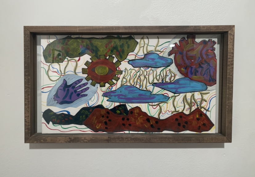
Art is often a reflection of the various facets of life; Camila Tapia-Guilliams’ All On Borrowed Time reminds us of our mortality, and how with our mortality comes the multiple problems that fail to be addressed in a lifetime – our current world of climate crises, the COVID-19 pandemic, and the negligence of world leaders that will lead to an inevitable struggle of future generations.
All On Borrowed Time, an acrylic and ink work, reflects the inevitability of death. The piece comprises dark colors – which reflect an imminent end of time and deliver a sense of urgency – against a contrasting backdrop of brighter-colored lines. Certain motifs drawn from nature such as clouds and what looks to be mountain ranges are also coupled with parts of the body: a heart, a hand, and an eye. These all go to show that our consciousness in our physical being is only temporary when compared to the persisting life in the nature that surrounds us.
Prior to seeing this piece, I had thought a lot about this topic of limited time and the inevitable end of our consciousness. When I first came across this work and read its label, I strongly felt Tapia-Guilliams’ sense of urgency on a personal level. It reminded me of a poem called I had written earlier in the year, when I had been feeling the heavy weight of time:
time is never measured
by the hour
for birds with instinct and light for clocks —
their only timeline
a horizon of a
setting / rising sun

[ it had been when their feathers
flew like fleeting seconds,
when suddenly birds
feared less the scale of time
than those of snakes ]

but even free spirits
paid the price of being prey
to the analog,
ticking to the 12
that split days into two
ha / ves of a whole

[ to the 12 —
a noon, a midnight, a dozen,
apostles, and law enforcement;
time ticked, and ticked off the 12
jurying life and what came next ]

- Hannah Zozobrado
less timeless
This notion of limited time – while quite invasive due to its sporadic and unwelcomed entrance in the mind – is nonetheless important to think about when deciding what long-lasting mark we want to leave on this earth, whether that be through preventing climate crises or stopping the spread of COVID-19 through individual action. Tapia-Guilliams’ ability to address us as mortal beings with a purpose despite our finite time on earth makes All On Borrowed Time especially resonant.
alternate universe: visualizing queer futurisms from February 10 to April 6, 2022 at The Stamp Gallery | University of Maryland, College Park | Written by Fiona Yang
Camila Tapia-Guilliams’ Blue Bodied and Self-Sentry are meant to be viewed in conversation. Both are acrylic on paper, and short, bright blue organic forms wriggle their way across both pieces. Tapia-Guilliams invites you to compare the differences between the two: the differing color schemes, the use of negative space, the sparse representational forms. Then, the pieces guide you towards their accompanying artist statements—two short poems, also titled Blue Bodied and Self-Sentry respectively.
Blue Bodied by Camila Tapia-Guilliams
Poetry in accompaniment to art can serve to both contextualize and further complicate. Wall text is meant to clarify the meaning of a piece; when confronted with poetry instead, the viewer is forced to analyze two works of art at once. The average viewer likely has little experience in analyzing either. In a way, this works to the artist’s advantage. An artist statement can deflate a piece, a paltry translation of a visual work into flat, accessible terms. Matisse, despite his own eloquence, famously declared that “a painter ought to have his tongue cut out.” One solution to this frequent artist’s dilemma? A rejection of the institutionalized, formulaic artist statement. Jennifer Liese, in N+1 magazine, writes, “For everyone’s sake—artists and the people and institutions working to support them—it would be better to welcome sense and nonsense, coherence and paradox, philosophy, poetry, and maybe even a little more than a page, all of which might truly represent, rather than reduce, artists and their art.”
With Blue Bodied and Self-Sentry, we see Liese’s proclamation in action. The two poems are meditations on looking, being looked upon and loved. Neither poem attempts to reduce their respective works to thematic elements or try to explain its brushwork. Instead, the poems reference principles that underlie all of Tapia-Guilliams’s work: community-centered care, collaborative worldbuilding, solidarity and love. In Blue Bodied, Tapia-Guilliams writes, “Maybe then when we hold each other again / We won’t fall apart / We can build ourselves up / And start fresh”; in Self-Sentry, they write, “The low view has its beauty in the weeds.”
Self-Sentry by Camila Tapia-Guilliams
In other artist statements, Tapia-Guilliams explicitly references works by queer theorists and scholars. In the description of What is Theirs is Mine, they direct viewers to the writing of nonbinary artist and writer Alok V. Menon. In true collaborative fashion, Tapia-Guilliams is aware that their words alone won’t be enough to explain the history, theory, and insight behind their work. Instead, they invoke the support of the queer intellectual and artistic community that inspired it in the first place.
Poetry and theory: rather than flattening the work, Tapia-Guilliams enriches it. The result is a collection of pieces that mutually support and reinforce each other. Tapia-Guilliams is fiercely committed to solidarity and care, and that ideological conviction shines through in the show.
Camila Tapia-Guilliams’s work is included in alternate universe: visualizing queer futurisms at the Stamp Gallery of the University of Maryland, College Park, from February 10, 2022 to April 6, 2022.
alternate universe: visualizing queer futurisms from February 10, 2022 to April 6, 2022 at The Stamp Gallery | University of Maryland, College Park | Written by Marjorie Justine Antonio
Sirens, newsreels, and the impending war, Static sparks with the brush of our hands, Messages in my palm. And I swipe, scrolling furiously; Fuel on empty. A deep breath. A whirl, a spin, a spiral, Close one eye, then another. A deep breath. Pull yourself up, Open one eye, then another. Gaze upon this place, Not new, not mine, A world not too different from the last, But where we can find What we need To survive.
– The Preface, Marjorie Justine Antonio
alternate universe: visualizing queer futurisms offers a look into how artists and creatives re/imagine history by shifting perspectives from mainstream narratives, responding to historical and contemporary issues, and engaging in the practice of world-making. This exhibition is rooted in the frameworks of futurist thought and aesthetics, from Afro-Futurism, Latinx futurism, Indigenous Futurism, Chicanxfuturism, and Techno-Orientalism, and explores futurism’s intersection with queerness. Here, queer futurisms are shaped by cross-cultural articulations of humanity met with burgeoning technology. Our queer future is a deep mediation of the past to inform the present and shape our future, or what some might call a practice of decolonization. Scholar José Esteban Muñoz describes queer futurity as a “structuring and educated mode of desiring that allows us to see and feel beyond the quagmire of the present…queerness is essentially about the rejection of a here and now and an insistence on potentiality for another world.”
Conceptually, alternate universe draws from other exhibitions that also explore queer futurity. This show was heavily inspired by Thea Quiray Tagle’s curatorial work with AFTER LIFE (what remains)at the Alice Gallery in Seattle, WA, and AFTER LIFE (we survive) at the Yerba Buena Center for the Arts in San Francisco, CA, and UCR ARTS at the University of California, Riverside’s traveling exhibition Mundos Alternos: Art and Science Fiction in the Americas. These exhibitions were integral to how I understood queer futurity in the contemporary art world, both aesthetically and thematically. Moreover, these shows exposed me to artists new and old who have responded to the call of imagining queer futures, para sa akin, para atin, para sa lahat. And with that, I cannot claim that the themes in this show are novel or particularly innovative, but are rather an extension and a continuing conversation of what is already here and what is to come.
alternate universe: visualizing queer futurisms places themes of speculative futures, queerness, gender, and survival in conversation with our current world. A juxtaposition of different mediums and focuses, from augmented reality artwork, game design and trans of color theory, to mixed-media and cooperative and anti-capitalist work, alternate universe ultimately engages in the questions:
What are the responses to the current state of our universe, our Earth, our world as queer/queered people? And how do we create and build alternate universes to survive?
Theme #1 – Queer futurity: aesthetics and content in the past, present, and future.
Queer futurity is present in this show not just in the aesthetic nature of new and immersive media, in which where art meets technology, but in the theoretical roots in indigenous sovereignty and anti-capitalism. The works of Camila Tapia-Guilliams and micha cárdenas meet for the first time in this exhibition. Their meeting is not a tiptoe around strangers, nor a barrage of content or wild-flung ideas, but a complementary union in a shared space.
Camila Tapia-Guilliams. All On Borrowed Time, 2021. 9 x 16.5”, acrylic, ink, collage on paper.
Tapia-Guilliams’ All on Borrowed Time (2021) is displayed a few steps away from cárdenas’ Redshift and Portalmetal (2014). Tapia-Guilliams’ work is energized by the multi-coloured lines in the background, reminiscent of Washington, D.C.’s metro lines, overlaid with ominous figures of a hand, heart, and the seeing eye, paralleled by what can be described as mountainous ranges on the top and bottom of the piece. Ambiguous shapes float in between the wavy words, leaving their meaning up for interpretation to the viewer. Here, what is to be grounded is hovering above, reflecting upon the topsy-turvy nature of time itself, where nothing is concrete or given.
cárdenas’ Redshift and Portalmetal is also dynamic in its format as an online game, and in its display on two computers in the rear section of the gallery, with one screen projecting onto the wall. Here, gallery visitors are able to recline onto the leather arm chairs to read and click through cárdenas’ poetic storytelling to be immersed into a world where climate change necessitates traveling outside of the known planet to a new land. Redshift and Portalmetal offers a lens to understand the experience of migration and settlement for a trans woman of color through the story of Roja, whose planet’s environment is failing. cárdenas’ Redshift and Portalmetal gives agency to the viewer, who must choose to survive or to perish, to leave or stay, and what it means to settle in a new world.
Together, Tapia-Guilliams and cárdenas’ pieces speak of the detrimental effects of climate change and the experiences of queer/queered people as they navigate through the present and future of our “new normal.”
“The only way to save our future and give us hope is to organize together around networks of care and resistance to the oppressive structures holding us to our current unsustainable timeline. Time is ticking; we need not turn back but learn from our past and look forward.”
Camila Tapia-Guilliams
Theme #2 – Worldmaking as a practice of community care and survival.
In alternate universes, characters typically find doppelgangers, deviations in time streams, the outcomes of the “what-ifs,” and more. While some alternate universes can be complicated in their mind-boggling physics, others are set in worlds where characters who passed in another universe are now alive, those who were struggling are now happy and fulfilled, outside of tragic plotlines of the fictional canons. Yet, alternate universes are not always completely different from their original worlds: they draw from what is already here.
In this exhibition, alternate universes are collaboratively constructed, from the Critical Realities Studio’s Sin Sol (2020), an augmented reality video game, to Camila Tapia-Guilliams’ mixed media collage series comprised of I Think We Should Change (2021), Take Me Back to Release Me Forward, Open My Eyes So I May Shut Them in Rest (2021), andThere Lies My Tired Eyes, May They Rest in Peace. The Smoke Has Clouded Them, Without Air I Cannot Breathe. The Fire Comes Out My Mouth. (2022).
Critical Realities Studio. Sin Sol / No Sun. Augmented Reality Video Game, 2020. http://www.sinsol.co/
Sin Sol by micha cárdenas, in collaboration with Marcelo Viana Neto, Abraham Avnisan, Kara Stone, Morgan Thomas, Dorothy Santos, Wynne Greenwood, Adrian Phillips, allows users to experience climate change-induced wildfires from a trans Latinx AI hologram named Aura and their dog, Roja. Within the gallery, folks are able to engage with Sin Sol through playing on the iPad app, or viewing the gameplay video. In either instance, Aura speaks to the viewer from fifty years in the future and narrates the effects of environmental collapse.
Collage series by Camila Tapia-Guilliams (left to right): Take Me Back to Release Me Forward, Open My Eyes So I May Shut Them in Rest (2021), 12 x 18”, acrylic, ink, collage on board; There Lies My Tired Eyes, May They Rest in Peace. The Smoke Has Clouded Them, Without Air I Cannot Breathe. The Fire Comes Out My Mouth (2022), 12 x 18”, acrylic, ink, collage on board; I Think We Should Change (2021), 12 x 18”, acrylic, ink, collage on board. Close Up: Camila Tapia-Guilliams. Take Me Back to Release Me Forward, Open My Eyes So I May Shut Them in Rest (2021).
Camila Tapia-Guilliams’ mixed media collage series honors their queer ancestors; acknowledges burnout and the pressures of capitalism on disabled people, LGBTQ+, women, people of color, and the working class; and calls to action what we should change in order to create better futures. Here, the past, present, and future are placed in conversation to see where we have been, where we are, and where we can go forward.
Theme #3 – The power of the word: affirmations, remediations, and articulations that hold us all together.
Throughout this exhibition, the power of words holds Tapia-Guilliams and micha cárdenas together. Both artists embed their own poetry and writing into their visual art practice, from cárdenas’ narration styles in both Redshift & Portalmetal and Sin Sol, to Tapia-Guilliams’ incorporation of poetry into the mixed media elements and within the artist wall labels themselves. cárdenas’ words are deep meditations on surviving climate change disasters, echoing throughout the gallery from the video installation, and then displayed throughout Redshift and Portalmetal. Here, cárdenas draws from the poetry of Black and Latinx feminists whose actions and words have enabled communities to survive.
Similarly, Tapia-Guilliams’ community-centered practice is evident through their incorporation of various theoretical models and inspirations right into their artist statements. With Exposure (2019-2020), Tapia-Guilliams references the work of Martha Fineman to expand upon vulnerability theory, and for There Lies My Tired Eyes, May They Rest in Peace. The Smoke Has Clouded Them, Without Air I Cannot Breathe. The Fire Comes Out My Mouth, Tapia-Guilliams refers viewers who are interested in rest as resistance to Tricia Hersey’s The Nap Ministry. Tapia-Guilliams offers further resources and reading with an invitation to the viewer to also meditate on their own understandings of queerness and queer futurity. Throughout this show, the viewer can clearly hear, read, and see articulations of queer futurity.
Curator’s Reflection
As a student docent for the last four years at the STAMP Gallery, I have had a distinct pleasure to curate this exhibition for a space that I know so intimately. It was a long and arduous process but ultimately seeing how viewers engage with the show in all of its elements has brought me so much joy during 2022’s hardest-hitting moments.
alternate universe has transformed the blank walls of the gallery into a canvas for new media and mixed media art, projection spaces for cárdenas’ augmented reality video game and web-based game, a venue for Tapia-Guilliams’ “Art for Community Care: Collaging Collective Action” event, and a reading nook for visitors to engage with the pop-up library. Furthermore, it holds the potentiality of queer joy at its core.
alternate universe: visualizing queer futurisms has cárdenas’ and Tapia-Guilliams’ words embedded in every corner, colorful projections and collages brightening the white gallery walls, space for students and community members alike to engage with queer dreams of the future, and a call to action for where we can go from here.
This exhibition and programming is supported by the Immersive Media Design Program (imd.umd.edu), The Harriet Tubman Department of Women, Gender and Sexuality Studies (wgss.umd.edu), University Libraries (lib.umd.edu), STAMP Events (stamp.umd.edu), and the Maryland State Arts Council (msac.org).
For more information on alternate universe: visualizing queer futurisms, visitThe STAMP Gallery.
A Contemporary Art Dedicated Space at the University of Maryland