Distinct Chatterfrom April 18 to May 20, 2022 at The Stamp Gallery | University of Maryland, College Park | Written by Marjorie Justine Antonio
In the last few weeks of the Spring 2022 semester, Stamp Gallery visitors can interact with Richardson-Deppe’s soft sculptures, Two Pants (2022) and Six Pants (2022), by tucking themselves into the supple and seemingly infinite loop of fabric. Tangled together, the visitor and the sculpture become one, blurring the line of where the person begins and the pants sculpture ends. Here, Richardson-Deppe allows the casual gallery visitor to be intimately acquainted with her work, both literally and metaphorically.
Charlotte Richardson-Deppe, Two Pants Portraits, 2022. Print on archival paper, 18” x 14”.
Richardson-Deppe’s work dynamically entangles fabric, fiber, and other textiles with themes of queerness, pain, love, loss, rest, desire, entanglement, memorial, and persona. Richardson-Deppe’s describes her work as “embodied autotheory” and writes that she is “preoccupied with the way that memories, relationships, and emotions are embedded in the cloth and clothing that humans surround ourselves with.”
Richardson-Deppe self-identifies as a queer feminist textile artist. A few of her exhibiting works speak directly to her identity and relationships, from her embroidered fabric work, Pillowcase (2021), and video performance Bodyknots (2022) with Mary Kate Ford.
Charlotte Richardson-Deppe, Pillowcase, 2021. Cloth, thread, 32” x 16”.
Pillowcase (2021) is the first mounted work visitors see when they enter the gallery. The mauve pillow case is punctured by red thread, and its accompanying placard transcribes the embroidered text, reading:
This pillowcase is for my lover’s pillow she will rest her cheek on these words she will sleep here and dream here I made this out of my love for her. This pillowcase will be cherished like my grandmother’s quilt which also lies on this bed, like the shirt I now wear that my aunt sewed for her brother, my father. Only the handmade receives this level of care, of protection, of desire. It is tailored solely for its intended purpose: it is singular and specific and made for Gabby for their extra long pillow that I stole from them each night when we first started dating, for this pillow that now lives on our bed that we share, on Gabby’s side of the bed, where we rest our heads, sleep, dream, whisper, cry, collapse, and sing.
Charlotte Richardson-Deppe
Here, Richardson-Deppe’s work immortalizes the connection between material objects and her significant others. Richardson-Deppe describes how her affection for her lover, Gabby, will be inscribed into the pillowcase, which will be cherished as the other clothing and material objects given to her by her family. The narration takes the reader through an intimate history: from the artists’ queer relationship and the future they dream up together. Through the patient process of embroidering letter by letter, memory and human relationships are tied to this intimate act of care.
Another example of queer intimacies is Bodyknots (2022), a performance video by Charlotte Richardson-Deppe and dancer Mary Kate Ford.
The video depicts two femme-presenting people entangled in thick, red soft rope interacting in a field of grass shrouded by thick clouds. This piece highlights the dynamic between two individuals who seemingly are unable to escape each other as they are bounded by a tangible thread. One pulls on the rope and the other attempts to escape until they both tumble to the ground together. In the grass, they both rest after a contentious struggle against each other, and share an affectionate cuddle, before helping each other rise again.
Stills from: Charlotte Richardson-Deppe and Mary Kate Ford, Bodyknots, 2022. Video, 7 minutes.Stills from: Charlotte Richardson-Deppe and Mary Kate Ford, Bodyknots, 2022. Video, 7 minutes.
Bodyknots shows the struggles of a relationship, whether that be the reckoning of one’s body and self, or between a loved one or partner. The red rope that connects the two performers together is symbolic of a key theme in the artist’s work:
“At its core, my work is about interdependence: I explore the joints and disjoints intrinsic to relying, depending, and caring for oneself and others in the world.”
Charlotte Richardson-Deppe
Charlotte Richardson-Deppe shines in the University of Maryland, 2nd year MFA in Studio Art group exhibition, Distinct Chatter, through her tactile soft sculptures, narrative descriptions of visible mending and darning, and queer intimacy through both thread and video. Her work entices the casual visitor to take a seat, get comfy, and ponder what it means to be comfortable in one’s own body and clothing.
See more from Charlotte Richardson-Deppe in “Distinct Chatter” — The STAMP Gallery’s current exhibition featuring three 2nd year MFA students, Mercedes, Hosna Shahramipoor, and Charlotte Richardson-Deppe, and is open until May 20, 2022.
Additionally, Charlotte Richardson-Deppe will be hosting a Visible Mending Workshop on Wednesday, May 11, 6:30-8:30 pm, co-hosted by Studio A and Stamp Gallery.
alternate universe: visualizing queer futurisms from February 10 to April 6, 2022 at The Stamp Gallery | University of Maryland, College Park | Written by Hannah Zozobrado
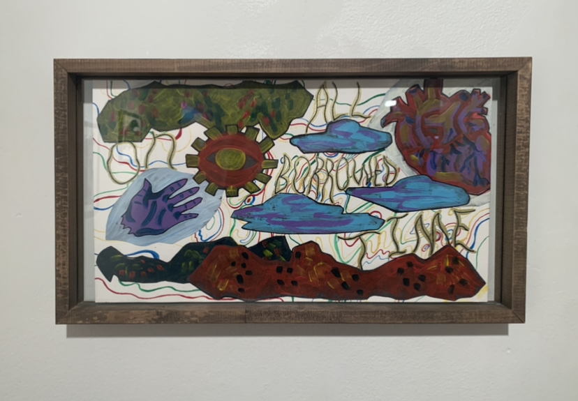
Art is often a reflection of the various facets of life; Camila Tapia-Guilliams’ All On Borrowed Time reminds us of our mortality, and how with our mortality comes the multiple problems that fail to be addressed in a lifetime – our current world of climate crises, the COVID-19 pandemic, and the negligence of world leaders that will lead to an inevitable struggle of future generations.
All On Borrowed Time, an acrylic and ink work, reflects the inevitability of death. The piece comprises dark colors – which reflect an imminent end of time and deliver a sense of urgency – against a contrasting backdrop of brighter-colored lines. Certain motifs drawn from nature such as clouds and what looks to be mountain ranges are also coupled with parts of the body: a heart, a hand, and an eye. These all go to show that our consciousness in our physical being is only temporary when compared to the persisting life in the nature that surrounds us.
Prior to seeing this piece, I had thought a lot about this topic of limited time and the inevitable end of our consciousness. When I first came across this work and read its label, I strongly felt Tapia-Guilliams’ sense of urgency on a personal level. It reminded me of a poem called I had written earlier in the year, when I had been feeling the heavy weight of time:
time is never measured
by the hour
for birds with instinct and light for clocks —
their only timeline
a horizon of a
setting / rising sun

[ it had been when their feathers
flew like fleeting seconds,
when suddenly birds
feared less the scale of time
than those of snakes ]

but even free spirits
paid the price of being prey
to the analog,
ticking to the 12
that split days into two
ha / ves of a whole

[ to the 12 —
a noon, a midnight, a dozen,
apostles, and law enforcement;
time ticked, and ticked off the 12
jurying life and what came next ]

- Hannah Zozobrado
less timeless
This notion of limited time – while quite invasive due to its sporadic and unwelcomed entrance in the mind – is nonetheless important to think about when deciding what long-lasting mark we want to leave on this earth, whether that be through preventing climate crises or stopping the spread of COVID-19 through individual action. Tapia-Guilliams’ ability to address us as mortal beings with a purpose despite our finite time on earth makes All On Borrowed Time especially resonant.
alternate universe: visualizing queer futurisms from February 10 to April 6, 2022 at The Stamp Gallery | University of Maryland, College Park | Written by Fiona Yang
Camila Tapia-Guilliams’ Blue Bodied and Self-Sentry are meant to be viewed in conversation. Both are acrylic on paper, and short, bright blue organic forms wriggle their way across both pieces. Tapia-Guilliams invites you to compare the differences between the two: the differing color schemes, the use of negative space, the sparse representational forms. Then, the pieces guide you towards their accompanying artist statements—two short poems, also titled Blue Bodied and Self-Sentry respectively.
Blue Bodied by Camila Tapia-Guilliams
Poetry in accompaniment to art can serve to both contextualize and further complicate. Wall text is meant to clarify the meaning of a piece; when confronted with poetry instead, the viewer is forced to analyze two works of art at once. The average viewer likely has little experience in analyzing either. In a way, this works to the artist’s advantage. An artist statement can deflate a piece, a paltry translation of a visual work into flat, accessible terms. Matisse, despite his own eloquence, famously declared that “a painter ought to have his tongue cut out.” One solution to this frequent artist’s dilemma? A rejection of the institutionalized, formulaic artist statement. Jennifer Liese, in N+1 magazine, writes, “For everyone’s sake—artists and the people and institutions working to support them—it would be better to welcome sense and nonsense, coherence and paradox, philosophy, poetry, and maybe even a little more than a page, all of which might truly represent, rather than reduce, artists and their art.”
With Blue Bodied and Self-Sentry, we see Liese’s proclamation in action. The two poems are meditations on looking, being looked upon and loved. Neither poem attempts to reduce their respective works to thematic elements or try to explain its brushwork. Instead, the poems reference principles that underlie all of Tapia-Guilliams’s work: community-centered care, collaborative worldbuilding, solidarity and love. In Blue Bodied, Tapia-Guilliams writes, “Maybe then when we hold each other again / We won’t fall apart / We can build ourselves up / And start fresh”; in Self-Sentry, they write, “The low view has its beauty in the weeds.”
Self-Sentry by Camila Tapia-Guilliams
In other artist statements, Tapia-Guilliams explicitly references works by queer theorists and scholars. In the description of What is Theirs is Mine, they direct viewers to the writing of nonbinary artist and writer Alok V. Menon. In true collaborative fashion, Tapia-Guilliams is aware that their words alone won’t be enough to explain the history, theory, and insight behind their work. Instead, they invoke the support of the queer intellectual and artistic community that inspired it in the first place.
Poetry and theory: rather than flattening the work, Tapia-Guilliams enriches it. The result is a collection of pieces that mutually support and reinforce each other. Tapia-Guilliams is fiercely committed to solidarity and care, and that ideological conviction shines through in the show.
Camila Tapia-Guilliams’s work is included in alternate universe: visualizing queer futurisms at the Stamp Gallery of the University of Maryland, College Park, from February 10, 2022 to April 6, 2022.
alternate universe: visualizing queer futurisms from February 10, 2022 to April 6, 2022 at The Stamp Gallery | University of Maryland, College Park | Written by Marjorie Justine Antonio
Sirens, newsreels, and the impending war, Static sparks with the brush of our hands, Messages in my palm. And I swipe, scrolling furiously; Fuel on empty. A deep breath. A whirl, a spin, a spiral, Close one eye, then another. A deep breath. Pull yourself up, Open one eye, then another. Gaze upon this place, Not new, not mine, A world not too different from the last, But where we can find What we need To survive.
– The Preface, Marjorie Justine Antonio
alternate universe: visualizing queer futurisms offers a look into how artists and creatives re/imagine history by shifting perspectives from mainstream narratives, responding to historical and contemporary issues, and engaging in the practice of world-making. This exhibition is rooted in the frameworks of futurist thought and aesthetics, from Afro-Futurism, Latinx futurism, Indigenous Futurism, Chicanxfuturism, and Techno-Orientalism, and explores futurism’s intersection with queerness. Here, queer futurisms are shaped by cross-cultural articulations of humanity met with burgeoning technology. Our queer future is a deep mediation of the past to inform the present and shape our future, or what some might call a practice of decolonization. Scholar José Esteban Muñoz describes queer futurity as a “structuring and educated mode of desiring that allows us to see and feel beyond the quagmire of the present…queerness is essentially about the rejection of a here and now and an insistence on potentiality for another world.”
Conceptually, alternate universe draws from other exhibitions that also explore queer futurity. This show was heavily inspired by Thea Quiray Tagle’s curatorial work with AFTER LIFE (what remains)at the Alice Gallery in Seattle, WA, and AFTER LIFE (we survive) at the Yerba Buena Center for the Arts in San Francisco, CA, and UCR ARTS at the University of California, Riverside’s traveling exhibition Mundos Alternos: Art and Science Fiction in the Americas. These exhibitions were integral to how I understood queer futurity in the contemporary art world, both aesthetically and thematically. Moreover, these shows exposed me to artists new and old who have responded to the call of imagining queer futures, para sa akin, para atin, para sa lahat. And with that, I cannot claim that the themes in this show are novel or particularly innovative, but are rather an extension and a continuing conversation of what is already here and what is to come.
alternate universe: visualizing queer futurisms places themes of speculative futures, queerness, gender, and survival in conversation with our current world. A juxtaposition of different mediums and focuses, from augmented reality artwork, game design and trans of color theory, to mixed-media and cooperative and anti-capitalist work, alternate universe ultimately engages in the questions:
What are the responses to the current state of our universe, our Earth, our world as queer/queered people? And how do we create and build alternate universes to survive?
Theme #1 – Queer futurity: aesthetics and content in the past, present, and future.
Queer futurity is present in this show not just in the aesthetic nature of new and immersive media, in which where art meets technology, but in the theoretical roots in indigenous sovereignty and anti-capitalism. The works of Camila Tapia-Guilliams and micha cárdenas meet for the first time in this exhibition. Their meeting is not a tiptoe around strangers, nor a barrage of content or wild-flung ideas, but a complementary union in a shared space.
Camila Tapia-Guilliams. All On Borrowed Time, 2021. 9 x 16.5”, acrylic, ink, collage on paper.
Tapia-Guilliams’ All on Borrowed Time (2021) is displayed a few steps away from cárdenas’ Redshift and Portalmetal (2014). Tapia-Guilliams’ work is energized by the multi-coloured lines in the background, reminiscent of Washington, D.C.’s metro lines, overlaid with ominous figures of a hand, heart, and the seeing eye, paralleled by what can be described as mountainous ranges on the top and bottom of the piece. Ambiguous shapes float in between the wavy words, leaving their meaning up for interpretation to the viewer. Here, what is to be grounded is hovering above, reflecting upon the topsy-turvy nature of time itself, where nothing is concrete or given.
cárdenas’ Redshift and Portalmetal is also dynamic in its format as an online game, and in its display on two computers in the rear section of the gallery, with one screen projecting onto the wall. Here, gallery visitors are able to recline onto the leather arm chairs to read and click through cárdenas’ poetic storytelling to be immersed into a world where climate change necessitates traveling outside of the known planet to a new land. Redshift and Portalmetal offers a lens to understand the experience of migration and settlement for a trans woman of color through the story of Roja, whose planet’s environment is failing. cárdenas’ Redshift and Portalmetal gives agency to the viewer, who must choose to survive or to perish, to leave or stay, and what it means to settle in a new world.
Together, Tapia-Guilliams and cárdenas’ pieces speak of the detrimental effects of climate change and the experiences of queer/queered people as they navigate through the present and future of our “new normal.”
“The only way to save our future and give us hope is to organize together around networks of care and resistance to the oppressive structures holding us to our current unsustainable timeline. Time is ticking; we need not turn back but learn from our past and look forward.”
Camila Tapia-Guilliams
Theme #2 – Worldmaking as a practice of community care and survival.
In alternate universes, characters typically find doppelgangers, deviations in time streams, the outcomes of the “what-ifs,” and more. While some alternate universes can be complicated in their mind-boggling physics, others are set in worlds where characters who passed in another universe are now alive, those who were struggling are now happy and fulfilled, outside of tragic plotlines of the fictional canons. Yet, alternate universes are not always completely different from their original worlds: they draw from what is already here.
In this exhibition, alternate universes are collaboratively constructed, from the Critical Realities Studio’s Sin Sol (2020), an augmented reality video game, to Camila Tapia-Guilliams’ mixed media collage series comprised of I Think We Should Change (2021), Take Me Back to Release Me Forward, Open My Eyes So I May Shut Them in Rest (2021), andThere Lies My Tired Eyes, May They Rest in Peace. The Smoke Has Clouded Them, Without Air I Cannot Breathe. The Fire Comes Out My Mouth. (2022).
Critical Realities Studio. Sin Sol / No Sun. Augmented Reality Video Game, 2020. http://www.sinsol.co/
Sin Sol by micha cárdenas, in collaboration with Marcelo Viana Neto, Abraham Avnisan, Kara Stone, Morgan Thomas, Dorothy Santos, Wynne Greenwood, Adrian Phillips, allows users to experience climate change-induced wildfires from a trans Latinx AI hologram named Aura and their dog, Roja. Within the gallery, folks are able to engage with Sin Sol through playing on the iPad app, or viewing the gameplay video. In either instance, Aura speaks to the viewer from fifty years in the future and narrates the effects of environmental collapse.
Collage series by Camila Tapia-Guilliams (left to right): Take Me Back to Release Me Forward, Open My Eyes So I May Shut Them in Rest (2021), 12 x 18”, acrylic, ink, collage on board; There Lies My Tired Eyes, May They Rest in Peace. The Smoke Has Clouded Them, Without Air I Cannot Breathe. The Fire Comes Out My Mouth (2022), 12 x 18”, acrylic, ink, collage on board; I Think We Should Change (2021), 12 x 18”, acrylic, ink, collage on board. Close Up: Camila Tapia-Guilliams. Take Me Back to Release Me Forward, Open My Eyes So I May Shut Them in Rest (2021).
Camila Tapia-Guilliams’ mixed media collage series honors their queer ancestors; acknowledges burnout and the pressures of capitalism on disabled people, LGBTQ+, women, people of color, and the working class; and calls to action what we should change in order to create better futures. Here, the past, present, and future are placed in conversation to see where we have been, where we are, and where we can go forward.
Theme #3 – The power of the word: affirmations, remediations, and articulations that hold us all together.
Throughout this exhibition, the power of words holds Tapia-Guilliams and micha cárdenas together. Both artists embed their own poetry and writing into their visual art practice, from cárdenas’ narration styles in both Redshift & Portalmetal and Sin Sol, to Tapia-Guilliams’ incorporation of poetry into the mixed media elements and within the artist wall labels themselves. cárdenas’ words are deep meditations on surviving climate change disasters, echoing throughout the gallery from the video installation, and then displayed throughout Redshift and Portalmetal. Here, cárdenas draws from the poetry of Black and Latinx feminists whose actions and words have enabled communities to survive.
Similarly, Tapia-Guilliams’ community-centered practice is evident through their incorporation of various theoretical models and inspirations right into their artist statements. With Exposure (2019-2020), Tapia-Guilliams references the work of Martha Fineman to expand upon vulnerability theory, and for There Lies My Tired Eyes, May They Rest in Peace. The Smoke Has Clouded Them, Without Air I Cannot Breathe. The Fire Comes Out My Mouth, Tapia-Guilliams refers viewers who are interested in rest as resistance to Tricia Hersey’s The Nap Ministry. Tapia-Guilliams offers further resources and reading with an invitation to the viewer to also meditate on their own understandings of queerness and queer futurity. Throughout this show, the viewer can clearly hear, read, and see articulations of queer futurity.
Curator’s Reflection
As a student docent for the last four years at the STAMP Gallery, I have had a distinct pleasure to curate this exhibition for a space that I know so intimately. It was a long and arduous process but ultimately seeing how viewers engage with the show in all of its elements has brought me so much joy during 2022’s hardest-hitting moments.
alternate universe has transformed the blank walls of the gallery into a canvas for new media and mixed media art, projection spaces for cárdenas’ augmented reality video game and web-based game, a venue for Tapia-Guilliams’ “Art for Community Care: Collaging Collective Action” event, and a reading nook for visitors to engage with the pop-up library. Furthermore, it holds the potentiality of queer joy at its core.
alternate universe: visualizing queer futurisms has cárdenas’ and Tapia-Guilliams’ words embedded in every corner, colorful projections and collages brightening the white gallery walls, space for students and community members alike to engage with queer dreams of the future, and a call to action for where we can go from here.
This exhibition and programming is supported by the Immersive Media Design Program (imd.umd.edu), The Harriet Tubman Department of Women, Gender and Sexuality Studies (wgss.umd.edu), University Libraries (lib.umd.edu), STAMP Events (stamp.umd.edu), and the Maryland State Arts Council (msac.org).
For more information on alternate universe: visualizing queer futurisms, visitThe STAMP Gallery.
alternate universe: visualizing queer futurisms from February 10, 2022 to April 6, 2022 at The Stamp Gallery | University of Maryland, College Park | Written by Mollie Goldman
A key work in the Stamp Gallery’s current exhibit alternate universe: visualizing queer futurisms is Sin Sol / No Sun by micha cárdenas. This is an augmented reality video game that immerses players in a world marked by more advanced effects of climate change. In her description of the game, cárdenas highlights her intention of illustrating “how climate change disproportionately affects immigrants, trans people and disabled people.”
While artwork often tells a story, Sin Sol / No Sun actually takes players through a ten-part poetic storyline fifty years in the future. By navigating a complex virtual space via the downloadable Sin Sol / No Sun app or an in-gallery tablet, participants experience a new world through the perspective of Aura, the game’s holographic, trans, and Latina protagonist. Aura and her dog, Roja, embark on an interspecies quest to escape climate change-induced wildfires in an environment created from 3D scans of a modern-day Pacific Northwestern forest. The pair flee the wildfires together and, in their pursuit of survival, they come across oxygen capsules that contain poetic fragments of their story. With this knowledge, viewers can experience the progression of environmental collapse and connect the unfolding events with the information shared in the capsules.
“It is so good to see you.
To know my words made it through time
To reach another heart, unthawed
Still a smoldering ember.”
In this piece, technology allows for the coalescence of visual art, storytelling, poetry, sound, and activism. Sin Sol / No Sun embodies the concept of “futurisms” within alternate universe both through the exploration of an impending catastrophe and also through the use of artificial intelligence technology to produce a magnificent, interactive world for viewers. Sin Sol allows viewers to look through their phone screens and see their own world with added virtual elements. These additions encourage movement and exploration through a physical space in order to piece together a story and begin a quest to survive.
Part of the app’s major appeal is the integration of participatory exploration into the narrative. Viewers experience the story as it unfolds and actively search for oxygen capsules with Aura and Roja. In this way, the audience partakes in the protagonist’s efforts to survive, which further intensifies the story.
Sin Sol / No Sun is a beautiful and immersive experience that educates viewers about the future of climate change, but it is also part of the future of art itself. Modern technological advances like this app enable viewers to do more than look; they encourage viewers to act. Through technology, cárdenas is able to convey her message and educate viewers with a much stronger impact.
micha cárdenas’ work is included in Alternate Universe: Visualizing Queer Futurisms at The Stamp Gallery of the University of Maryland, College Park, from February 10, 2022 to April 6, 2022.
Download Sin Sol from the App Store. For more information on Alternate Universe: Visualizing Queer Futurisms and related events, visit https://thestamp.umd.edu/stamp_gallery
Yams, tomatoes, Potatoes & Plums from October 25, 2021 to December 11, 2021 at The Stamp Gallery | University of Maryland, College Park | Written by Isabella Chilcoat
While the Yams, Tomatoes, Potatoes, & Plums exhibition in the STAMP Gallery is visually exquisite and captivating, we ought to understand why and how this “genre” arose and the deeper effects of colonization and appropriation. The long history of Australia finds frequent neglect in the American education system, limiting our public’s broader acumen of Australian culture generally, but especially of the communities native to the territory. Because of such limited familiarity, it is easy for our American brains to consume the current works on display only for their “pretty colors” while forgoing a comprehensive appreciation for the artists or the sordid history they endured all to eventually gain notoriety in the mainstream art scene. I should adjust — a mainstream art scene that has traditionally rejected or degraded not just female artists and artists of color, but has also abused indigenous artists by appropriating their culture or denying the artists the credit they are due based on a lack of “formal training” or societal ignorance. It is, therefore, critical that we, as the public encountering Indigenous Australian art, inform ourselves and learn how to interpret works outside of our conventional artistic canon.
Bessie Petyarre, Bush Plum, 2021, Acrylic. 123 x 115 cm. | Naata Nungurrayi, Marrapinti, 2001, Acrylic. 46 x 91 cm
The most helpful place to start is researching directly from the source. Our exhibit features an informative primary source video interview in the first gallery niche on our right side wall with one of the artists, Esther Bruno Nangala. She explains her work, Bush Tomato, its symbols, and, briefly, customs of harvesting and processing of bush tomatoes in her community. She details the importance of the harvest for women with their parts in planting, collecting, and then processing the tomato by grinding it into a paste and rolling the paste into balls for children to eat. Here, we can gather an easily accessible contextual basis for at least one painting in the collection.
Observer, viewing Esther Bruno Nangala’s interview featured in the STAMP Gallery
Moving into some of the broader history of Australian history of Indigenous peoples and Western colonization of the land, the beginnings of colonial activity arose in the late 16th Century. On January 26, 1788 British Captain, Arthur Phillip, landed in Australia simultaneously marking the land’s first foreign settlement and the commencement of an enduring brutal campaign over indigenous peoples and their land for Britain’s territorial growth. The years to follow obliterated native populations through the devastation and dispossession of lands, introduction of diseases, and direct violence. Today only 3.3% of Indigenous people remain in the Australian population.
Some of the greatest problems arise in describing Indigenous artworks when art critics, collectors, curators, and large museums neglect the historical context and fail to attribute the same credit to Indigenous and self-taught artists as “classically trained” Western artists. Certain terminology repeatedly arises in the Western media that degrades the credibility of othered artists (“other “ being non-white, non-Western) — negatively connotated descriptors include words like “untrained,” “primitive,” “tribal,” “primal,” “untainted,” or “pure,” etc. Such a phenomenon arises when people hold the context of the works over the physical form. For instance, when looking at a piece by Leonardo daVinci, arguably the most famous name in Western “classical” art, most people of the general public understand him as a “master” and, accordingly, ascribe importance to his works based on his known history alone – just from seeing his name with a painting. This is not to say that da Vinci’s works are not technically impressive, but there is an automatic, or implicit, bias connected with how much the general public already understands about him.
it is pivotal that we can appreciate their context while analyzing the formal elements by their own merit.
So, when we look at the acrylic paintings on display in the Yams, Tomatoes, Potatoes & Plums exhibit, it is pivotal that we can appreciate their context while analyzing the formal elements by their own merit. Furthermore, the approach to examining the form of an Indigenous artwork or one by a self taught artist – without implicit bias – is to completely abandon anything we know contextually and to compare on the same pedestal the work to any other similar pieces that it inspires. Here, we ensure that the artist receives all the credit she deserves, fairly. That is not to contradict the first half of this essay by any means, though. We need to employ the context to understand or empathize with the work’s meaning, but not when analyzing formal elements against a different work or while forming an initial impression.
Naata Nungurrayi, Bessie Petyarre, and Esther Bruno Nangala’s work is included in Yams, Tomatoes, Potatoes, & Plums at The Stamp Gallery of the University of Maryland, College Park, from October 25, 2021 to December 11, 2021.
For more information on Yams, Tomatoes, Potatoes & Plums and related events, visit The STAMP Gallery.
Yams, Tomatoes, Potatoes & Plums from October 25, 2021 to December 11, 2021 at The Stamp Gallery | University of Maryland, College Park | Written by Helen Feng
There are many striking and remarkable characteristics of the artwork in this new exhibition, Yams, Tomatoes, Potatoes & Plums. This show celebrates the bush tucker of First Nations Australia with works created by contemporary indigenous Australian artists. Anyone that walks by the gallery sees that these pieces are huge attention-grabbers, with their millions of dots and dashes and the patterns and textures made of the paint. What stood out the most to me was the outstanding and vibrant array of colors. None of the pieces were dull at all, many created with blends of reds, yellows, and purples. There were even pieces that included every color in the rainbow.
This show feels like a big celebration, and the colors contribute to this feeling. With so many golden tones, the painting emitted a sort of light, and brightness to the gallery, drawing people in to appreciate the work. As a viewer, these pieces give me a sense of welcoming and of uplifting hope. The prosperous colors highlight the bountifulness and prosperity in life, urging the viewer to appreciate and remember everything they have around them.
New Arrivals 2021 from August 30 to October 16, 2021 at the STAMP Gallery | University of Maryland, College Park | written by Fiona Yang
Akea Brionne Brown’s All American Boys is a part of her series “A Brown Millennial” (2020), an exploration of “what it means to exist as a young, black, American woman in a time where everything feels uncertain.” The rest of the series focuses on Brown’s experiences with white American femininity; All American Boys stands out as the single piece that deals with masculinity.
In All American Boys, Brown drapes herself in mass-produced cloth, patterned with stereotypical images of cowboys. The mass-production of those images parallels the commodification of the “Wild West” narrative. President Theodore Roosevelt and contemporary figures such as James Cox and Joseph McCoy played a large part in romanticizing the role of cowboys on the frontier, leading to the enormous popularity of Wild West shows and rodeos, Western films, and the enduring concept of the “Wild West” in TV shows, novels, comics, and video games.
Westerns—recognized to be the most popular Hollywood film genre from the 1900s to the 1960s—descend narratively from “knight-errants” of European literature and poetry. Knight-errants, much like the gunslingers of Westerns, are lone male figures, bound by chivalry and codes of honor, exacting their personal conceptions of justice and fairness. Both are also inherently masculine genres. The men of Westerns are “real men”—stoic, charismatic with women, occasionally violent, secure in their masculinity.
All American Boys takes these tenets of Western masculinity and raises them to absurd heights. There’s barely any “cowboy” upon close examination—just white men, adorned with wide-brimmed hats, bootcut jeans, and other accoutrements. If Westerns serve to affirm masculinity, the cowboy in All American Boys parodies it. Conventionally attractive white men, shirtless, posed to show off their chiseled bodies—rather than emphasizing their masculinity, this portrayal undercuts it by posing the men for a titillating female audience. Even the name evokes a sense of sarcasm—“All American Boys,” instead of “All American Men,” derides this uniquely American conception of masculinity. Westerns are a power fantasy. Conversely, the cowboys on the cloth are objects of desire, stripping them of agency and interiority.
https://www.instagram.com/p/CTkZHUzsH4k/
The cowboys’ objectification is heightened by Brown’s self-portrait, which stands in stark contrast to the bare-chested men. The cloth is wrapped over the majority of her figure, implying feminine modesty. Her lips are glossed, and the only glimpse the viewer gets of her collarbone and shoulder implies that she is shirtless. These aspects lend coy sexuality and vulnerability to the portrait. Despite this, Brown stares directly at the viewer, challenging them to confront the implications of her surrounding background. She inserts herself directly into a parody of whiteness and masculinity, undeniably real and defiant. As a Black woman, she serves as a reminder of historical context, grounding these images firmly in reality.
The genre of Westerns are inextricably linked to whiteness. Protagonists in Westerns perform violent, extrajudicial acts valorized by the narrative. In fact, their acts are often portrayed as necessary: unachievable through judicial means, because of bureaucracy, corruption, and moral weakness. Meanwhile, historical Black and Indigenous responses to injustice were demeaned and minimized. Indigenous attempts to defend their lands were portrayed as hostile attacks on white settlers. Black cowboys—which historians estimate made up to 25% of the Texan cowboy population—were nominally equal to white cowboys. The dangerous, difficult work of cattle herding necessarily created respect and camaraderie. But they were still given harder, more dangerous tasks on the trail, expected to take on additional duties such as cooking and performing, and were turned away from certain restaurants and housing in the towns they passed through. Even today, it’s clear whose anger is legitimized and whose is demonized: white backlash to cultural change got Trump elected to the White House, while Black Lives Matter has been deemed politically corrosive outside a small circle of progressive lawmakers.
All American Boys is a commentary on the absence of Black cowboys in our narratives of the Wild West, which has historically enforced white male power structures. In All American Boys, Brown looks us directly in the eye and questions our conceptions of masculinity, of whiteness, of the Wild West. The conclusion she reaches is inevitable: that white male masculinity is untenable, an exaggerated performance, and deeply intertwined with revisionist whitewashed histories.
Akea Brionne Brown’s work is included in the CAPP 2021 New Arrivals at The Stamp Gallery of the University of Maryland, College Park, from August 30 to October 16, 2021.
New Arrivals 2021 from August 30 to October 16, 2021 at The Stamp Gallery | University of Maryland, College Park | Written by Mollie Goldman
The Contemporary Art Purchasing Program’s New Arrivals 2021 include a variety of impactful artworks. Amongst the array of bright, colorful pieces displayed in the Stamp Gallery is a contrastingly shadowy, enchanting set of images: Kei Ito’s Under My Skin #1. This piece consists of two silver gelatin monoprints with a severity that evokes both beauty and contemplation. Ito is, uniquely, a photographer who does not use a camera. Rather, he manipulates light sensitive materials with sunlight exposure and various additives to produce images that reference the nuclear destruction from the atomic bombing of Hiroshima in 1945.
Ito has a distinct connection to this tragedy. His grandfather survived the bombing, losing many of his loved ones as well as the city he called home. Much of Ito’s work is inspired by his grandfather’s stories of the bombing and the after-effects. Ito artistically depicts the emotional trauma and physical damage, while also implementing his abstract style and contemporary perspective.
In Under My Skin #1, honey and oil are added during production to create cellular structures throughout the image. These represent cancer cells, an unseen but nonetheless devastating affliction that impacted countless survivors of the bombing, including Ito’s grandfather. The use of honey and oil is deliberate for more than just appearance. After the bombing, the unavailability of basic medicine and supplies forced survivors to treat burns on their own with honey and oil.
The dark, cancerous appearance of Under My Skin #1 directly reflects the devastation of the Hiroshima bombing. However, the metallic golden hues (and the artist’s very existence) adds an element of strength, persistence, and life to the piece. Ito exists to share his story because his grandfather survived and lived on despite emotional and physical wounds.
Fire and light are often symbolic of life and also death. In Ito’s work, they appear to symbolize both simultaneously. Under My Skin #1 directly reflects the devastation of the Hiroshima bombing, but it also displays survival against all odds. Using sunlight, honey, oil, and a deep connection to his roots, Ito indubitably portrays a powerful message of perseverance through pain.
Kei Ito’s work is included in the CAPP 2021 New Arrivals at The Stamp Gallery of the University of Maryland, College Park, from August 30 to October 16, 2021.
For more information on Kei Ito, visit http://www.kei-ito.com/. For more information on New Arrivals 2021 and related events, visit https://thestamp.umd.edu/stamp_gallery
Amidst from April 12, 2021 to May 15, 2021 at The Stamp Gallery | University of Maryland, College Park | Written by Fiona Yang
On Tuesdays, Elizabeth Katt sits at her desk in the gallery and works on her piece, “An Accounting: Through December.” By hand, she meticulously documents each death due to coronavirus in the United States – one tally for each life lost, according to data from Worldometer and Columbia University. Viewers steer respectfully clear around her desk, occasionally pausing to watch. Katt initially curated a playlist of mourning and protest songs from different cultures, but found it too distracting and now works, for the most part, in silence (Maryland Today).
When Katt is not working, her desk sits empty and quiet. The piece’s significance is apparent whether or not the artist is present; heaps of adding machine tape in the windows attest to COVID-19’s toll even without Katt’s silent labor as accompaniment. As a docent, with my own work to get absorbed in, there is only one significant difference between Katt’s presence and absence: each Tuesday at half-hour intervals, I am startled out of my reverie by Katt announcing to the silent gallery, “December 23rd. Three thousand, four hundred and five lives.”
“December 24th. Two thousand, eight hundred and ninety-six lives.”
“December 25th. One thousand, four hundred and ten lives.”
As the pandemic wore on in the US, breezing by its one-year anniversary on March 11, it became apparent that people were growing tired of confinement. The New York Times termed the phenomenon “quarantine fatigue.” Online engagement with COVID-19 was highest in March, when people entered lockdown; since then, attention has declined and stayed low. Axios summarizes, “Online interest in the coronavirus has been associated mostly with how disruptive it’s been to people’s lives rather than how severe of a risk it posed.”
It’s human nature to tune out information that makes us uncomfortable, especially if it doesn’t directly affect us. But that inattention can have deadly consequences. As alarm over COVID-19 waned and “quarantine fatigue” set in, data shows people were staying home less and taking longer trips – as early as April of last year, just a month after quarantine started.1 Inevitably, when people ventured back outside in defiance of COVID-19 regulations, the New York Times reported corresponding spikes in new cases. Dramatic surges were observed in July 2020 and January 2021,2 coinciding with warm summer weather and holiday family gatherings respectively. Warnings from state governments and public health ordinances were disregarded. And throughout it all, quietly and without fanfare, the US death toll climbed. The US counts over 585,000 COVID-19 deaths. The New York Times reported 33,041 new cases yesterday alone.
In “An Accounting,” Katt says out loud the number of lives lost to COVID-19 per day. It is her way of coming to terms with the inconceivable losses the US has suffered – breaking down the number 585,000 into small, manageable chunks. It drives home the fact that these losses were incremental and cumulative, each day filled with preventable deaths.
By shattering the silence in the gallery, Katt metaphorically shatters the apathy and silence that settled over the topic of COVID-19 after March. No doubt the number 585,000 – if not more, since new cases are still being reported – will be held up after quarantine ends as a tragic and sizable number. But it is not the post-pandemic reaction that matters. It is the present actions of an uncaring public that will determine the spread and impact of COVID-19. And Katt’s periodic reminders reflect the importance of that fact.
NYT reported in April 2020, “In Texas, 25 percent of people stayed home on April 24, compared with 29 percent on April 10, two weeks earlier. In Ohio, people took 3.2 trips, on average, on April 24, up from an average of 2.8 trips two weeks before. In Louisiana, people traveled an average of 31.1 miles, up from 24.7.”
In July of 2020, NYT reported a spike of 66,784 average new cases. In January of 2021, NYT reported another spike of 254,002 average new cases.