
We Live in the Sky: Home, Displacement, Identity from October 16 to December 7, 2024 at The Stamp Gallery | University of Maryland, College Park | Written by Noa Nelson

Mami Takahashi’s video performance Writing Myself is a fascinating exploration of identity, language, and the paradoxes of self-expression. In this work, Takahashi uses writing as a tool not to reveal herself but to disappear, turning what could be a deeply personal form of communication into an act of obscuration. By transforming writing into a form of erasure, she invites us to contemplate the contradictions inherent in sharing our experiences while simultaneously shielding them from understanding.
The piece unfolds as Takahashi writes in Japanese –her mother tongue– on transparent film, using this familiar language to express anecdotes, quotes, memories, and thoughts. Born and raised in Tokyo, Takahashi often draws on themes of displacement and distance from home, and the use of Japanese in her work becomes a way of grounding herself within these feelings. The physicality of her process is deliberate and measured, it feels both intimate and meditative. As she writes, the text gradually builds up, creating a dense layer of characters that ultimately forms a barrier between her and the viewer. Her presence, once clearly visible, becomes obscured behind a wall of words, a literal screen of her thoughts that paradoxically makes them unreadable.
In Writing Myself, Takahashi wrestles with the tensions between expression and obscurity. On the one hand, writing is an act of communication—a way to connect, to leave behind a trace of one’s thoughts and experiences. But by layering the text until it becomes indecipherable, she complicates the act of sharing through writing. Her words, meant to be seen, are concealed, much like memories that fade with time or thoughts that lose clarity in translation. This paradox reflects the struggle between the desire to express oneself fully and the instinct to hide or protect certain truths.
Takahashi’s work also comments on the way we face reality or escape from it. Writing, in many ways, serves as a means of confronting one’s experiences, offering a way to make sense of the world. Yet in Writing Myself, writing also becomes a means of retreat—a way for the artist to distance herself from the viewer. As she disappears behind her own words, she creates a space where the boundary between revelation and concealment becomes blurred. It’s as if she is using language to construct a mask, one that hides her while simultaneously revealing the contours of her thoughts.
For those who do not read Japanese, the text remains an opaque screen, inviting them to reflect on the limits of their understanding. Even for those who can read the language, the layering of characters turns the script into a visual rather than legible experience. The tension between the familiar and the inaccessible is present, echoing the complexities of cultural identity and the experiences of those who navigate multiple worlds.
Writing Myself serves as a powerful meditation on the contradictions of self-expression. Takahashi’s methodical writing process becomes an act of introspection, yet the final product is a wall that prevents true insight into her mind. It is a reminder that the act of sharing is never straightforward—every word we offer can also be a means of concealing, and every attempt to communicate can result in further mystery.
Through Writing Myself, Mami Takahashi challenges us to reconsider what it means to understand another person’s experiences. She invites us into her world, only to remind us that some aspects will always remain out of reach. Her piece, like the layers of text she builds, is a beautiful contradiction—an artwork that is as much about what it conceals as what it reveals. It serves as a reminder that art, much like language, is often most powerful when it embraces the spaces between expression and obscurity.
Mami Takahashi’s work is included in We Live in the Sky: Home, Displacement, Identity at The Stamp Gallery of the University of Maryland, College Park, from October 16 to December 7, 2024.
For more information on Mami Takahashi, visit https://mamitakahashi.art/.
For more information on We Live in the Sky: Home, Displacement, Identity and related events, visit https://stamp.umd.edu/centers/stamp_gallery.


 Stamp Gallery on March 15, 2024
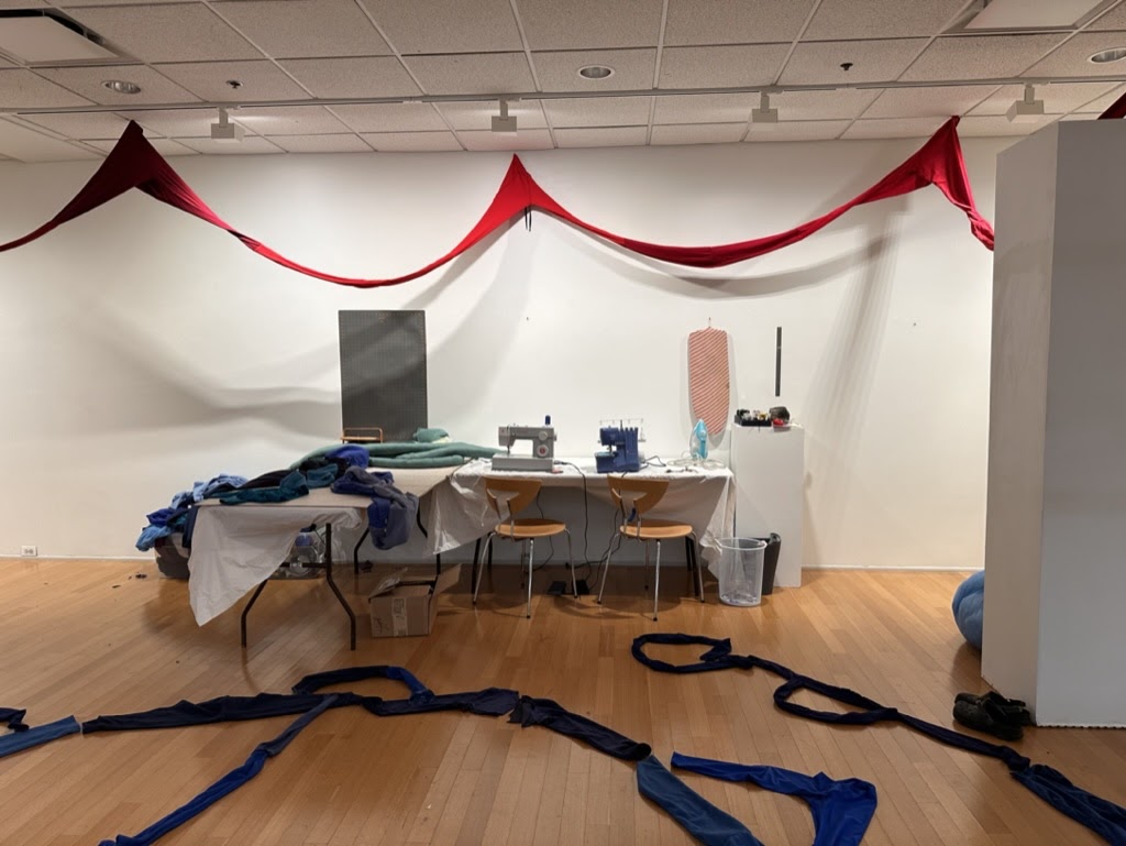 Stamp Gallery on March 15, 2024
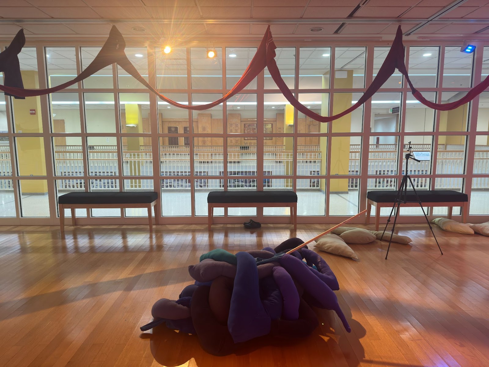 Stamp Gallery on April 05, 2024
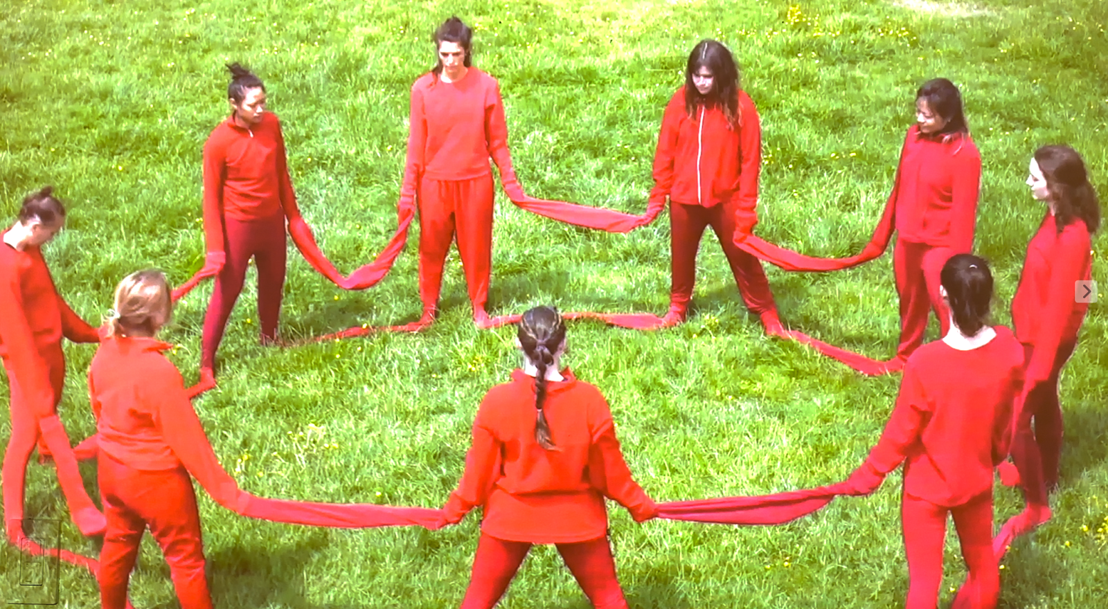 Charlotte Richardson-Deppe, Red (2023), Screenshot from video. Performers: Gwyneth Blair, Lisa Dang, Sarah Gnolek, Amanda Murphy, Charlotte Richardson-Deppe, Kat Ritzman, Jill Stauffer, Allie Wallace, Jackie Wang.
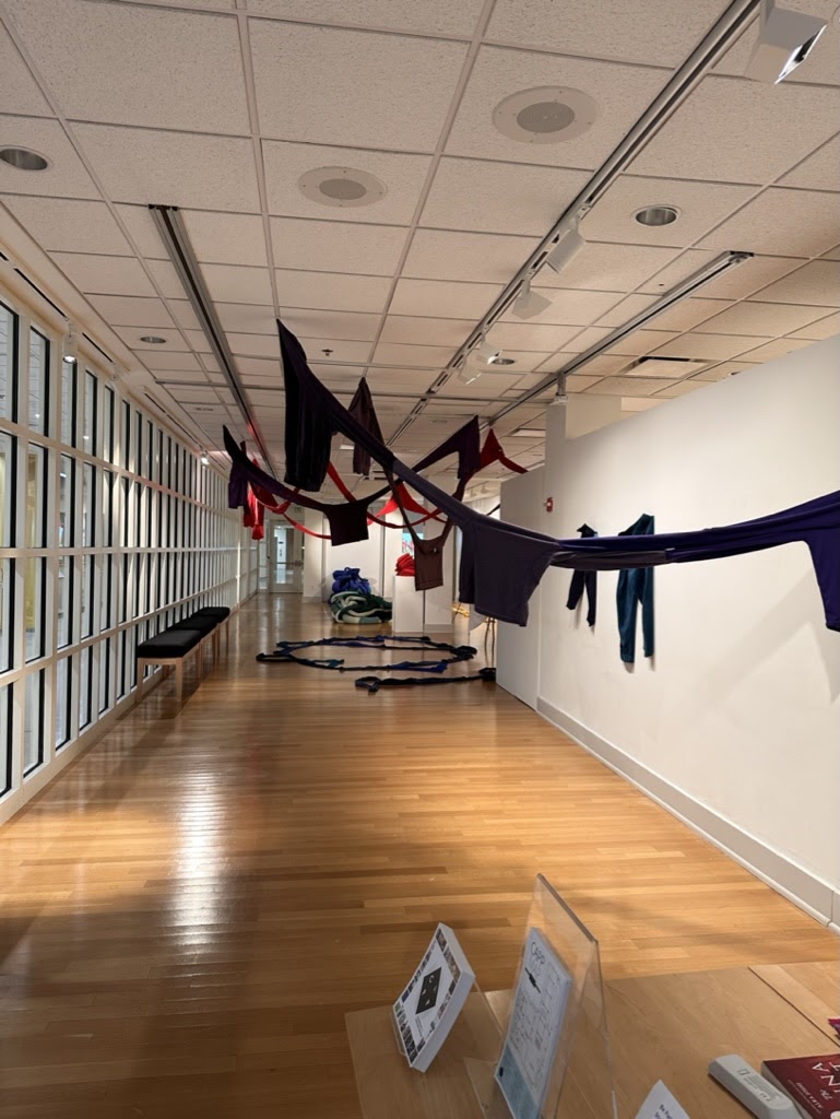 Stamp Gallery on March 15, 2024
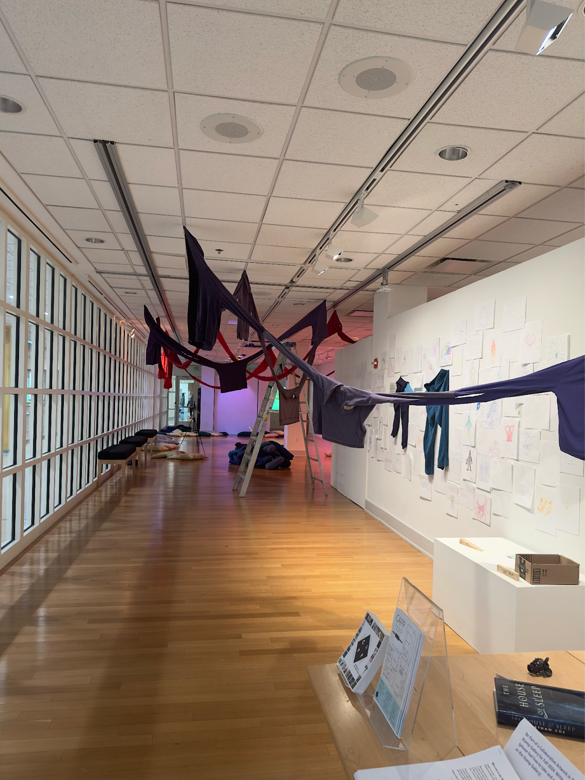 Stamp Gallery on April 05, 2024


